May 1 , 2018 | Launches and Campaigns
The art of standing out, reflected in a new logo
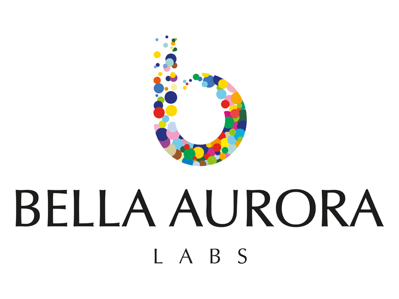
Bella Aurora Labs has changed one of its most important corporate symbols: its logo. The new corporate image is based on the image of Bella Aurora’s, the company’s flagship brand. It is a fusion of two strong concepts: Bella Aurora and Labs. Bella Aurora symbolises delicacy and experience, and as the name suggests, it means beauty. On the other hand, Labs means quality, rigour and innovation, suggesting internationalisation.
From an aesthetic point of view, the typography, a humanist design, is reminiscent of traditional calligraphy. Designed by Hermann Zapf in the 1950s, the Optima typography is influenced by stone-carved letters from Ancient Rome, and the early Renaissance. What’s more, the geometry of the lower-case “b” is smooth and flexible, denoting a friendly company with no sharp edges. The circular shape suggests stability, harmony and balance.
When it comes to colour, black is strong and elegant, while the colourful bubbles in the “b” are reminiscent of creativity, freshness and optimism. They combine to transmit the diversity of people, ways of thinking, ideas, brands, products solutions and countries that make Bella Aurora Labs a reality.
The new logo ingeniously combines the organisation’s basic characteristics: rigour, innovation, creativity, diversity, ambition, modernity, optimism, friendliness and life.
